
May 18, 2026
Human vs. AI - Part III
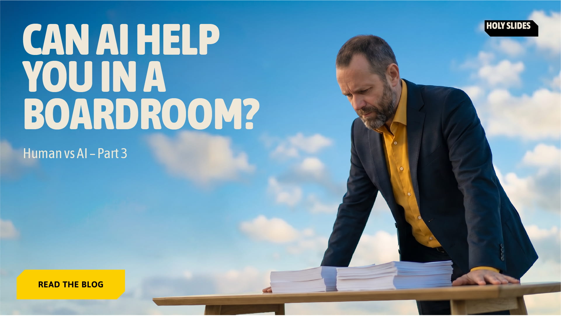
We Took Both Decks Into the Boardroom. Only One Survived.

Zyon de Jesus
We Took Both Decks Into the Boardroom. Only One Survived.
We recreated a boardroom situation we’ve been in many times with enterprise clients. Big internal transformation. Serious decision. Real consequences. We made two decks for it. One with AI. One by our designer Michał. The AI deck was correct and complete. The human deck was simpler and more opinionated. The board didn’t pick the deck with more slides. They picked the one that made the decision feel easier to live with.
We’ve been in this exact room before. Enterprise client. Senior leadership. Long table. Printed decks. Someone pouring water a bit too loudly because the room is quiet.
The decision was familiar too:
Do we move forward with this transformation now, or slow things down?
Everyone understands the upside.
Everyone worries about the downside.
No one wants to be the person whose name gets attached to “remember when we rushed that?”
So we recreated it.
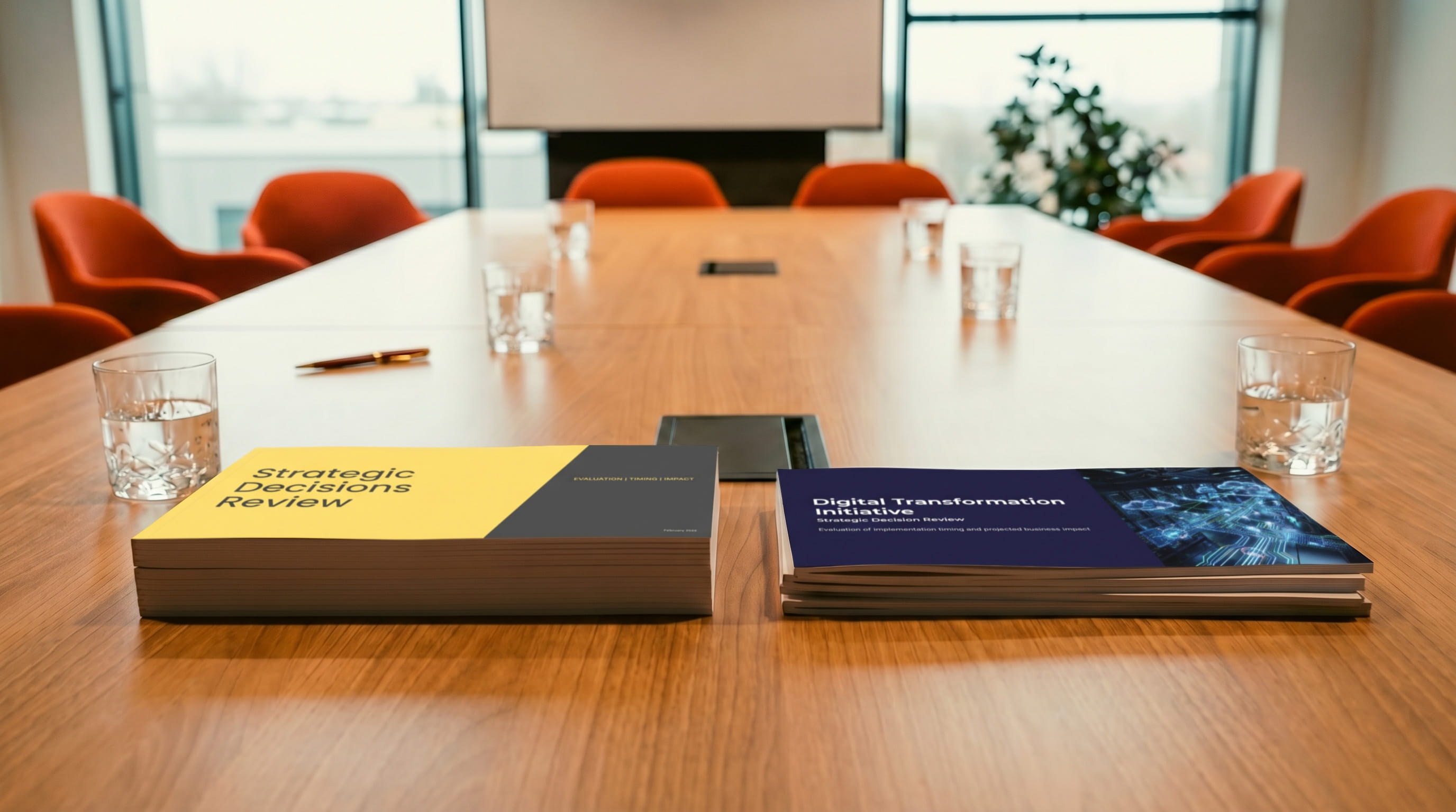
We created two versions of the same boardroom presentation.
Same company.
Same transformation.
Same business context.
One version was generated with AI.
The other was designed by Michał using the same approach we use with enterprise clients.
We weren’t trying to prove AI wrong.
We just wanted to see if AI would naturally behave the way strong boardroom decks behave in real life.
Same situation. Same decision. Two very different approaches.
The AI deck was good. Like, actually good.
It had the right sections in the right order. Timelines made sense. Risks were mentioned. Dependencies were mapped. Nothing felt sloppy or rushed.
If you skimmed it afterward, you’d probably think, “Yep, this checks out.”
That was also the problem.
It didn’t surprise anyone.
It didn’t annoy anyone.
It didn’t make anyone lean forward.
It felt like the kind of deck that’s been approved a thousand times before. Careful. Neutral. Informative. The kind you could swap the logo on and reuse next quarter without anyone noticing.
And honestly? That’s how most board decks look.
They’re written to avoid being wrong, not to help people decide.
.png)
Michał did something different (and slightly uncomfortable)
The human deck didn’t try to cover everything.
It focused on the one thing everyone in the room was already thinking about but hadn’t said out loud yet:
What happens if this goes wrong.
There was a slide that laid it out plainly. No drama. No “worst case scenario” language. Just real numbers, realistic timelines, and a simple comparison between doing nothing and moving forward but missing targets.
This is where design mattered.
Not because it looked cool — but because it made the point unavoidable. Big headline. Clear contrast. Enough space that your eyes landed exactly where they should. You didn’t need someone to explain it. You just… got it.
In most board meetings, this moment still happens. Someone eventually says, “Just to play devil’s advocate…” and then awkwardly walks everyone through the downside while half the room stares at the table.
Putting it on the slide saved everyone that ritual.
.png)
Nothing magical happened.
No one gasped.
No one clapped.
No one said, “Wow.”
The meeting just got easier.
People stopped flipping pages. They stopped asking where something was covered. They started reacting instead of navigating.
When someone asked, “If this doesn’t work, what do we tell the teams next year?”, the answer wasn’t hidden across three slides. It was already there, framed in a way people could actually repeat in their own words.
That’s usually the moment you want. When the deck stops being the thing everyone manages and starts being the thing that quietly supports the conversation.
.png)
There was no winner announced.
No one criticised the AI deck.
No one praised the human deck.
Someone just said, “Let’s use this version as the base and keep working from there.”
Everyone nodded.
Notes were made.
The meeting moved on.
If you’ve been in enough boardrooms, you know that sentence means the decision is basically done.
This meeting was about whether to move forward at all.
Next, we’re recreating something harder: a five-year strategy discussion. No obvious answer. No safe option. Just a room full of people trying to decide what kind of company they want to be.
.png)
What it doesn’t do as well is decide what deserves attention and what doesn’t. It doesn’t feel the room. It doesn’t know which slide will make people pause or which one they’ll forget five minutes later.
That’s still a very human thing.
Good design in these situations isn’t about being creative. It’s about making the important parts impossible to ignore and the uncomfortable parts easier to talk about.
That’s what made the difference here. And it’s the same difference we keep seeing with real clients.


